Monday, 15 February 2016

Star Wars Sketch in 2 point perspective


This lesson we used the supplied star wars speeder blueprints create a sketch in 2 point perspective. we got some examples and information on how to try and approach this sketch.


My sketch:


Sunday, 14 February 2016

Insect character designs

For this homework I was to create an original design concept for an “insectoid” character, in the game genre and style of my choice. So this could be for example a fantasy based character or monstrous, intelligent. 


sketches:
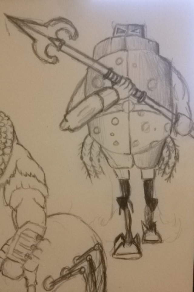
These were my sketches for my insect character. I plan for the character to have a weapon and show it to be a bulky warrior.


Final 3 point sketch:  
Rough colour for final:

Final design:
This is my colour concept art of the character in a three-quarter view. This shows a dramatic pose but still needs to clearly convey the design of the character. This was done in Photoshop.


Friday, 12 February 2016

My background design remake

Using this image from the game Fez, this would be my guide for taking my concept art backgrounds and turn them into a more 2D pixel art style.


So I tried this style out for my sci fi room (scene 3) and this was the result. 

Concept design:

Remake to 2D Pixel art idea:

Final Design:

Wednesday, 10 February 2016

Life Drawing week 17:

This sessions life drawing was to focus on perspective once more. However this time we had the model stand behind a wooden cage and was told to mainly use the cages gaps as a guideline to help with propositioning the model.


Though this was a little hard at first I got more and more used to drawing the cage and model, and as this happened the drawings where given more detail and looked more realistic. Though my personal favorite was the 3rd image, where the model was sitting down in the cage. I surprisingly got the shapes right and the cage didn't look unnatural.


Monday, 8 February 2016

3 point perspective


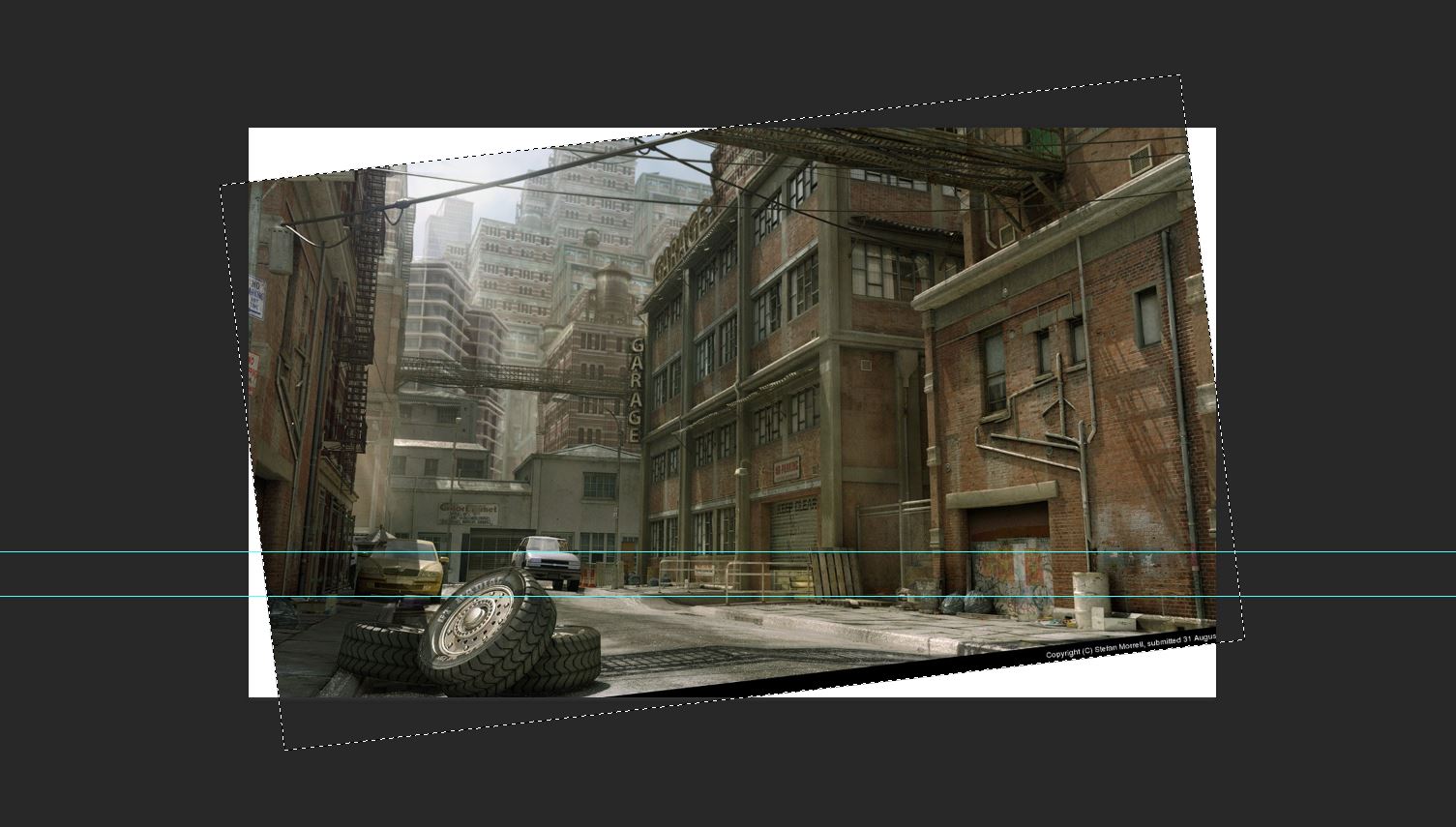
3 point perspective is very similar in construction to 2 point perspective but with a third vanishing point for the lines that are vertical in reality, to give an impression of height when the viewpoint is looking up or looking down.  For this session we will try to find the vanishing point of a 3 point perspective.
Images used for 3 point perspective:


making the vanishing point:


Now that I have an understanding of 3 point perspective, it was time to put practice to the test. For the last hour of the lesson, I used my 2 point perspective design of the sci fi room and changed the positions and size of the objects in the room as well as the angle of the room.
 
Remake your room into 3 point perspective:


Comparing and changing the rooms perspective form 2 point to 3 point:


Monday, 1 February 2016

Animating pixels

Due to the lecture we had in the morning we only had time to work on a 1 hour session. This session was to learn to animate with pixel art. In this case we had to change the eye colour of a pig and make it move.


My version:


Saturday, 30 January 2016

snow part of the level

Reference used for snowy background:
Image of a real snowy mountains to help me understand the colour concept and how the trees blend into the snow.


This one was how mountains look in pixel art, based on the game 'There was a Caveman'. I might consider this design as a guide for remaking my background design:


A rough sketch an idea for my final background:
This was a 30 minute sketch showing a rough plan on what my second scene would look like. Now I plan to add more detail to the art work and attempt to make a 2D design.

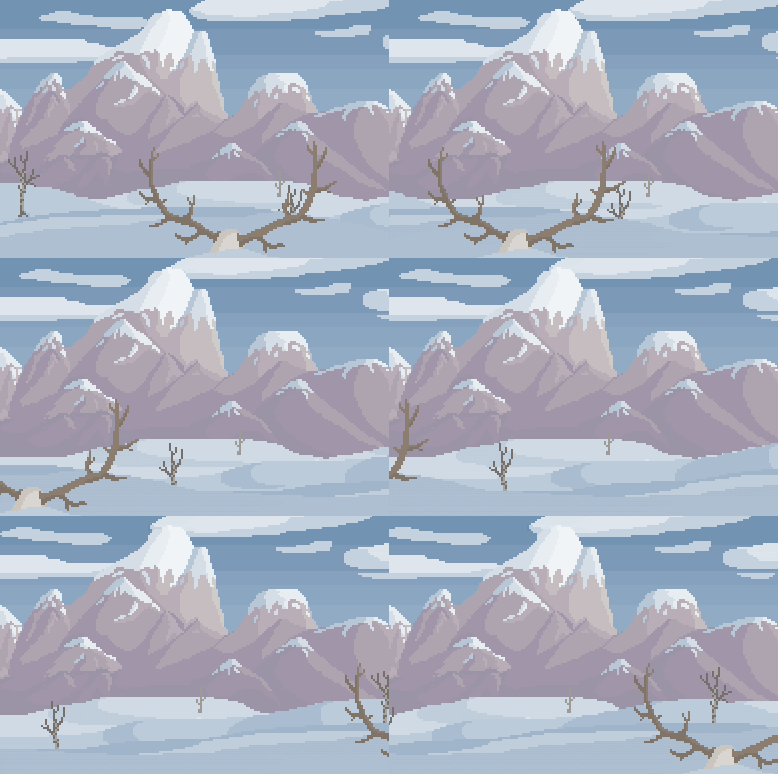
My level design for snowy mountains:

2nd try:

Though I have changed a few things for this background, such as the building and the platform, I get the feeling that there is still work to be done with this and though this is a good practise I feel as though I need more time to make a neater pix-elated version of this. 

Update on this background:
After revisiting this background, I thought it was time to add the trees and neaten things up a bit more. So with the help of my group (giving me advice and feedback on my background) I was able to darken the saturation so that the characters will stand out more