Saturday 30 January 2016

snow part of the level

Reference used for snowy background:
Image of a real snowy mountains to help me understand the colour concept and how the trees blend into the snow.


This one was how mountains look in pixel art, based on the game 'There was a Caveman'. I might consider this design as a guide for remaking my background design:


A rough sketch an idea for my final background:
This was a 30 minute sketch showing a rough plan on what my second scene would look like. Now I plan to add more detail to the art work and attempt to make a 2D design.

My level design for snowy mountains:

2nd try:

Though I have changed a few things for this background, such as the building and the platform, I get the feeling that there is still work to be done with this and though this is a good practise I feel as though I need more time to make a neater pix-elated version of this. 

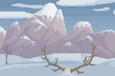
Update on this background:
After revisiting this background, I thought it was time to add the trees and neaten things up a bit more. So with the help of my group (giving me advice and feedback on my background) I was able to darken the saturation so that the characters will stand out more


Wednesday 27 January 2016

Life Drawing week 16:

Now comes the part where we had to draw the model sitting down, we mainly used a mixture of pencil and charcoal for this lesson. It was simple. To draw the basic body features of the model with charcoal and for the detailed parts of the body e.g. tone. we had to use pencil. 


My personal favorite was the second to last picture where I drew the model posing whilst sitting down. I put in a lot of good tone and lines to this drawing which gave it a lot of detail. If all my drawings where like this, I would be amazed.


Rougly Adding The Body

Now comes the hard part. Having to model the body for a muscular Viking is no easy task. But I digress. To start with I had to cut the head in half and only had a mirror to work with. This makes the task a lot easier and quicker, as I make a change on one side it will work copy on the other. All I would need to do once iv finished one half would be to duplicate and reverse the other half.

So it once again comes down to referencing. I looked at a few images to work with, however these ones where the only ones I considered and used. But even these ones was hard to follow.


This image shows half of my Viking god statue taking shape. But I still need to work on making the body fatter and have a better proportion. I think I will consider stretching it out or perhaps use Zbrush to help form the muscles. We shall see. But as for now I have roughly the size and length right, just not the shape and msucles. 


Background Concept ideas for levels

This really helped me gain an idea on what my sci fi room should look like. Not only will this help for idea wise, but also the colours would be useful to use. I just love it!
Reference and ideas for room:


Does this look familiar? It should if your  a gamer. It's someone interposition and concept idea  of a well known franchise, Megaman. Showing a classic pixel style.

This was to be my concept idea on what the Sci Fi room background will look like for the game. This would be the 3rd scene showing once the player has entered the room. 

Final concept of Sci Fi room Scene 3(enter the building):

Monday 25 January 2016

practising lighting and shade

Jordu Schell was the artist who made this creature. Using his creature we practiced on how to make shadow and discussed how light behaves on curved surfaces.
This session ties in to previous classwork we did. For example the robot silhouette and the cube shading.


 and this was my final result after 2 hours.


Steampunk sketches and ideas

About Steampunk:
Steampunk is a sub-genre of sci fi that typically features steam-powered machinery rather than our modern use of electricity. One of the most popular time period to reference steampunk is in the western civilisation during the 19th century, mainly in the British Victorian era or the wild west. Others however do tend to favour a post apocalyptic style to steampunk, rather than using the past era's. This style could work in a futuristic or fantasy world that includes steam powered machines, weapons or even beings

Moodboard On Steampunk Designs:

Research:
'How to Draw and Colour Steampunk Characters' by David Antram.

This was a book souly to design and work on steampunk ideas. From styles, to colour, this book was very useful and helped me to develop my ideas further. 


My Sketches:
These are just a few of my sketches to try and create an idea for my final piece on steampunk. I will be mainly looking to design characters.


Drawing Steampunk Cyborgs:
Inspired by adding clockwork objects, like cogs and clocks and wheels.

My final piece: part one:
I decided to stick with the steampunk cyborg thief. He looks like the most interesting sketch to work on, and possibly one of the hardest. I gave him a lot of detail while sketching him. Though I begin to regret drawing two sides of him, as it will take a while to complete painting him. I plan on using a lot of gold and steal colours, as well as brown clothes to add a bit of weight to the character.

Together:

Wanted Poster:

This is using my final designs and placing it on as a wanted poster. This could make my character look like a threatening villain or a criminal in some futuristic world. I have to say that I really like this character, I enjoyed working on him and felt as though it was an interesting design. I personally love to draw cyborgs and steampunk styled ones are a pleasure to draw. Though I feel that the painting was a little to light, it was still a good effort.

Friday 22 January 2016

2D angry birds art


This was a practise on how to go about our 2D game style in terms of design. For this session we were to make an example of this style by using Adobe illustrator. From there on in, it was just us copying the angry birds 2D art.
The key difference between pixel and vector art is based on how the image is structured. Pixel art are made up from lots of tiny physical squares, where as vector art has more smoother lines.

Wednesday 20 January 2016

Life Drawing week 15:

First part of the session was to draw 3 minute poses as quick and as detailed as we could get. This is normal now and it is pleasant to see that my sketches improving very week.


This second part of the session was to use a different technique of drawing. This time we were to paint with blue oil. As a former painter, I very much enjoyed this part of the lesson. I even managed to work on the tone of the model. Though some succeeded and others... not so much.


For this last image was an attempt to draw the models feet. It was by far the hardest part of the body to draw and as you can see bellow, one side of the foot has stronger lines than the other. But it was a good try at least.


Tuesday 19 January 2016

modeling hands

For this I had to use the female reference as a guide line, then I carried on with the YouTube tutorial shown bellow:


The references I used was placed on maya (similar to how I placed the anatomy head on maya for the head) and then followed in with the shape and patterns. I mainly used the front and side view to change the angle and position of the model to make it accurate and realistic. 


Creating the fingers was the easy part. For this I had to use a cube object, change the edges to 8 and stretch it in the length that would be a roughly a human finger size. I then got rid of the flat end and replaced it with half a sphere. This was to be the tip of the finger. Once I connected the two together, I had adjusted the divisions to 4 and matched the finger to the reference. I moved the edges and extruded them to make the nail and shaped the finger until I was satisfied. Finally duplicating the fingers and (one for the thumb) I attached them together and changed the lengths slightly. 

This was the final result of my modelled hand on maya. This model focuses on the male hand, which was what I needed for my Viking statue.